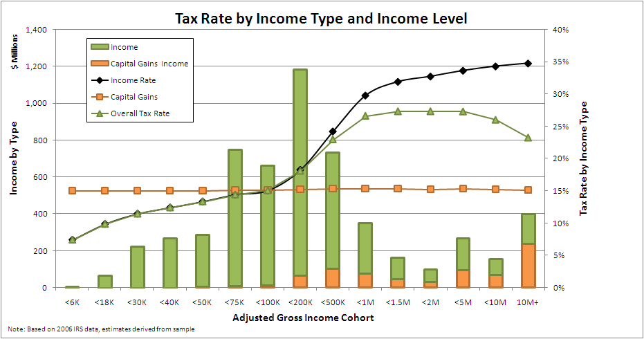
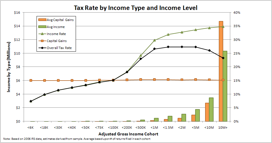
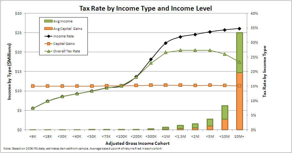
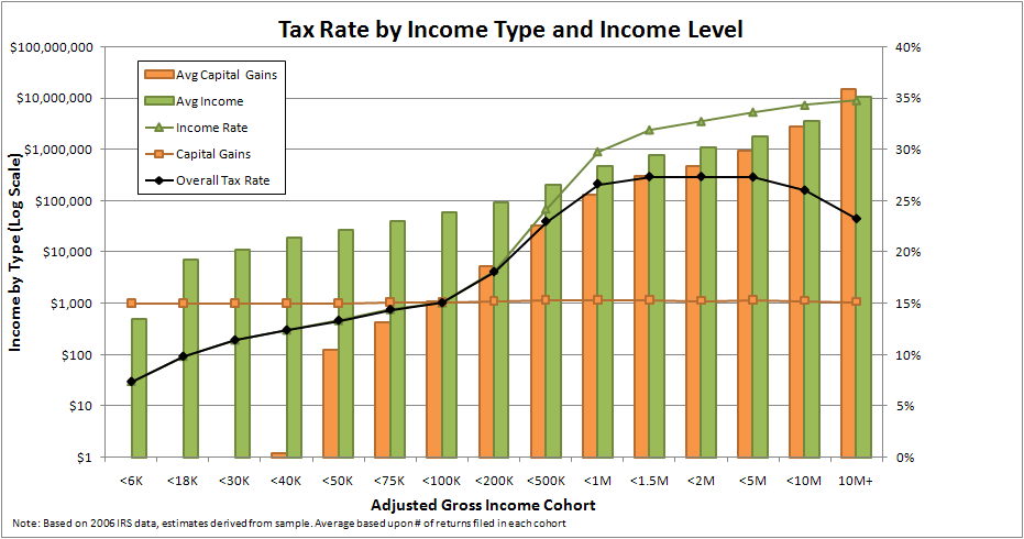
I re-ran my prior analysis of effective tax rates across AGI (adjusted gross income) cohorts using updated data from 2007. We see the same trend as in 2006 – the extremely rich pay a lower effective tax rate than the not-quite as rich, due to most of their income coming from capital gains which is taxed at a flat 15% rate. This analysis makes a great case for tax reform – both in higher marginal tax rates for cash income on the rich, and for an rate increase or even rate marginalization on capital gains. Since households have a large degree of flexibility for when they realize capital gains (they aren’t taxed until you close the position), a lifetime marginal rate would be a solid approach. An example would be your first $50k of lifetime capital gains being untaxed, then each $50k after that being taxed at an additional 5% until you reach the cap.
While the results are nearly identical, but it did provide the opportunity to build some new data visualizations. The “average total income and effective tax rate” graph was generated using Think-Cell, and the “% of income by type and associated tax rates” graph was generated using Excel 2007.
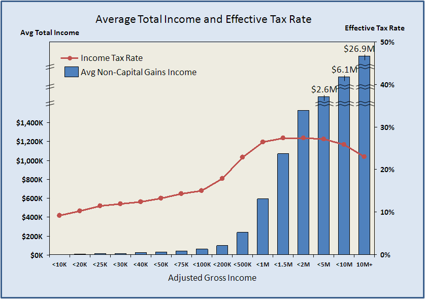
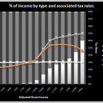
Data available at the IRS website here, published as Individual Complete Report (Publication 1304), Table 3.5